I led the end-to-end design of #include's e-commerce management platform, a free alternative to Shopify and Etsy built for small business owners. I owned user research, information architecture, interaction design, and prototyping across multiple rounds of iteration.
Role
Product Design
Skills
Research, Visual Design, Prototyping
Outcome
15+ high-fidelity screens
Research
Analyzing how sellers manage their stores
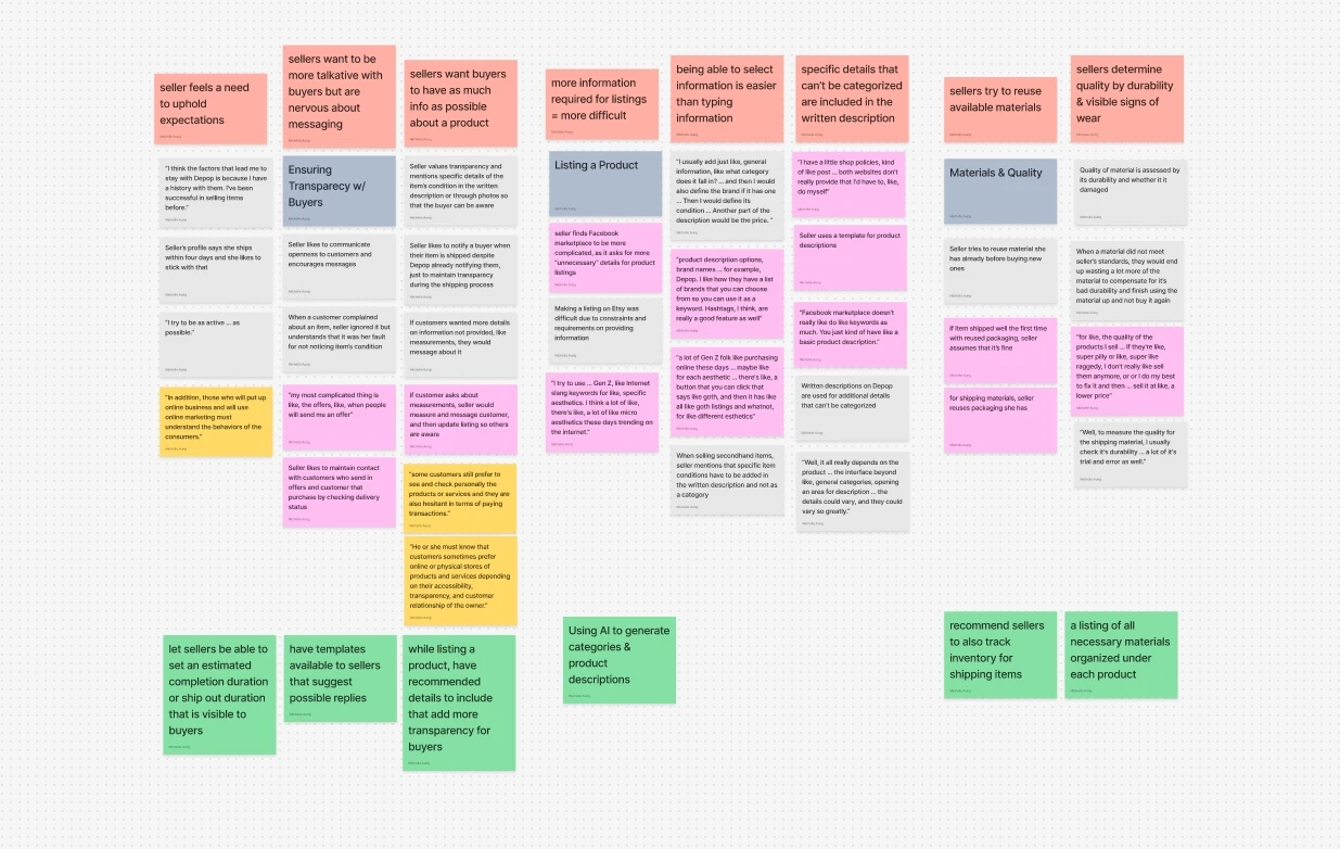
I conducted a user survey, two in-depth interviews with active online sellers, and a literature review. I focused interviews on sellers using Depop and Facebook Marketplace since they most closely represented the cost-conscious independent sellers we were designing for. Findings were synthesized using an affinity map.

The Cereal Box
One seller told me she once ran out of shipping materials mid-order and had to mail a product in a cereal box. She didn't realize she was out until she was already fulfilling her order.


The Problem
Small business owners needed a simpler way to manage their stores.
Through interviews and research, three patterns emerged:
Tedious listings
Poor inventory tracking
Sellers had no reliable way to track the raw materials behind their products, so shortages surfaced.
Confusing shipping
Without clear guidance on carrier rates, sellers guessed at the right option.
Design Process
Mapping features to user needs
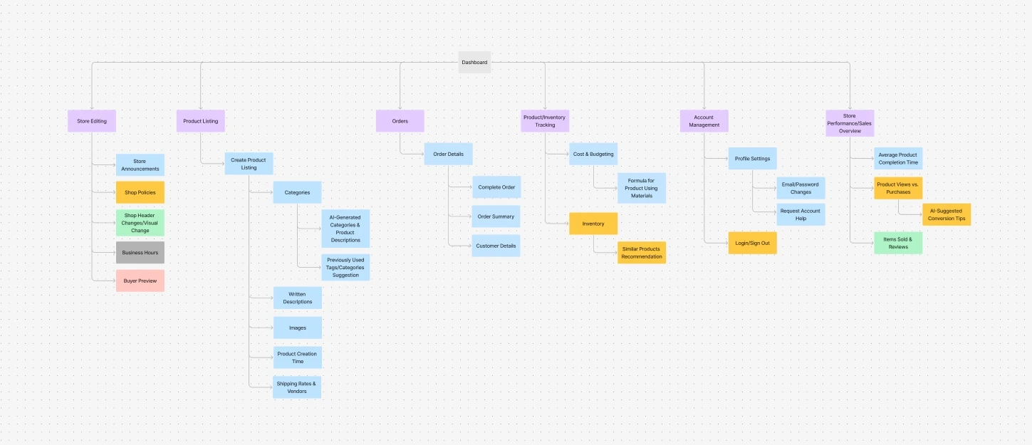
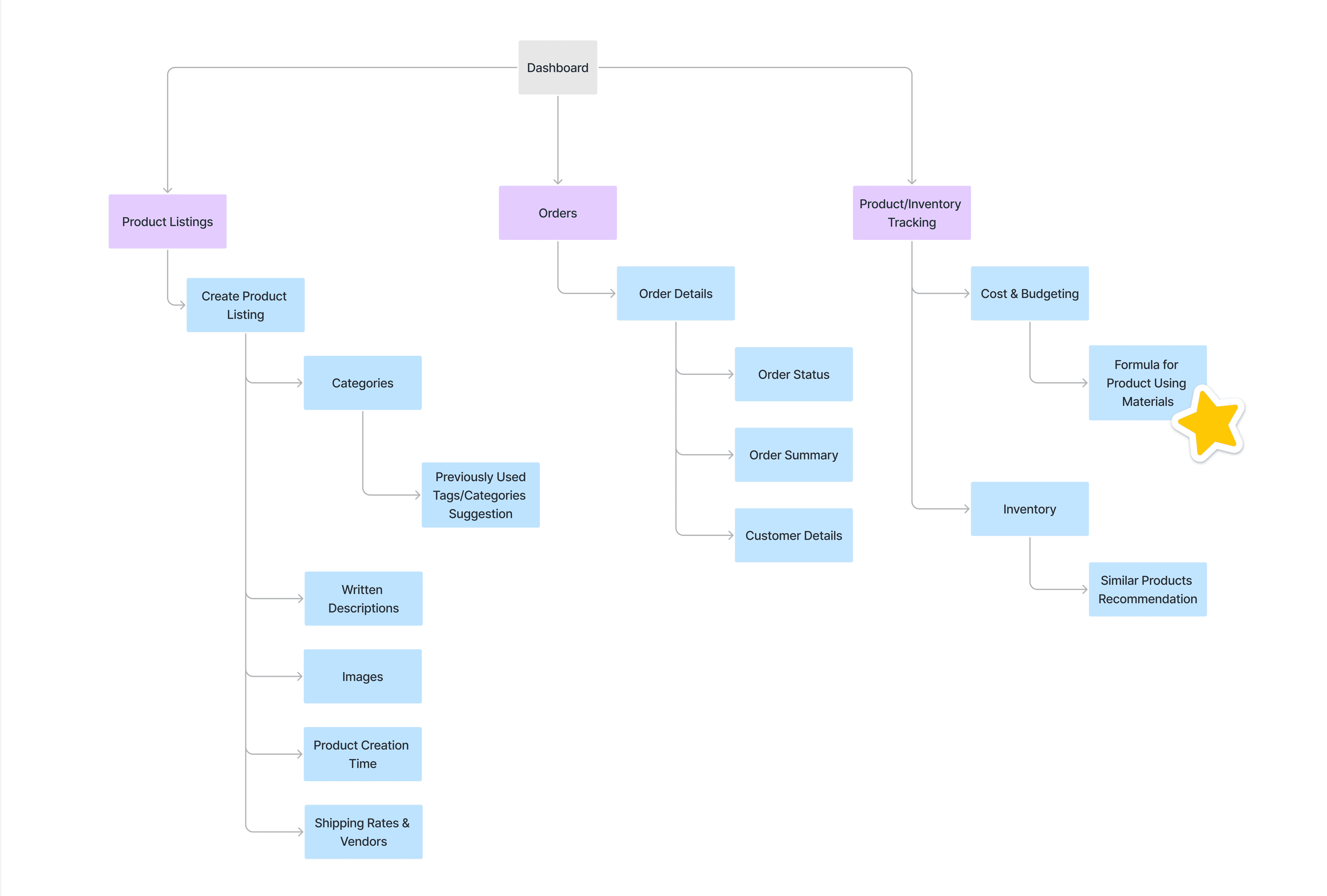
I created an information architecture tree to map every possible page and feature, then worked with the development team to assess feasibility and narrow scope to what was realistically buildable. This process surfaced a lot of ideas we couldn't pursue, like an AI trend prediction, due to technical limitations. However, it helped us clarify what features to move forward with.
Defining features and prioritizing flows
To address sellers' issues with poor inventory tracking, I came up with the "Materials" feature. This feature allows sellers to define which materials go into each product, and the platform calculates how many units they can make from current stock. Vendor information is logged alongside each material, so when stock runs low, reordering is straightforward.
Alongside this feature, I prioritized designing flows like product listings, inventory tracking, and order fulfillment because they were the core components of running an e-commerce shop. Seller's experiences with tedious listings and confusing shipping informed my design decisions throughout the project.
Referencing established patterrns
From there I moved through lo-fi sketches into high-fidelity designs in Figma, referencing established patterns from Shopify and Etsy to ground the layouts in familiar conventions.


First Design
Designing the core flows
These were the first high-fidelity designs I presented to the development team, covering four core flows: listing a product, tracking inventory, adding an inventory item, and managing orders.
Materials Needed
The materials formula was a work in progress. In this early version, it was called "Materials Needed" and lived under Inventory Tracking. It was a rough design, but the core idea was still there: give sellers visibility into what goes into each product and how much it costs.

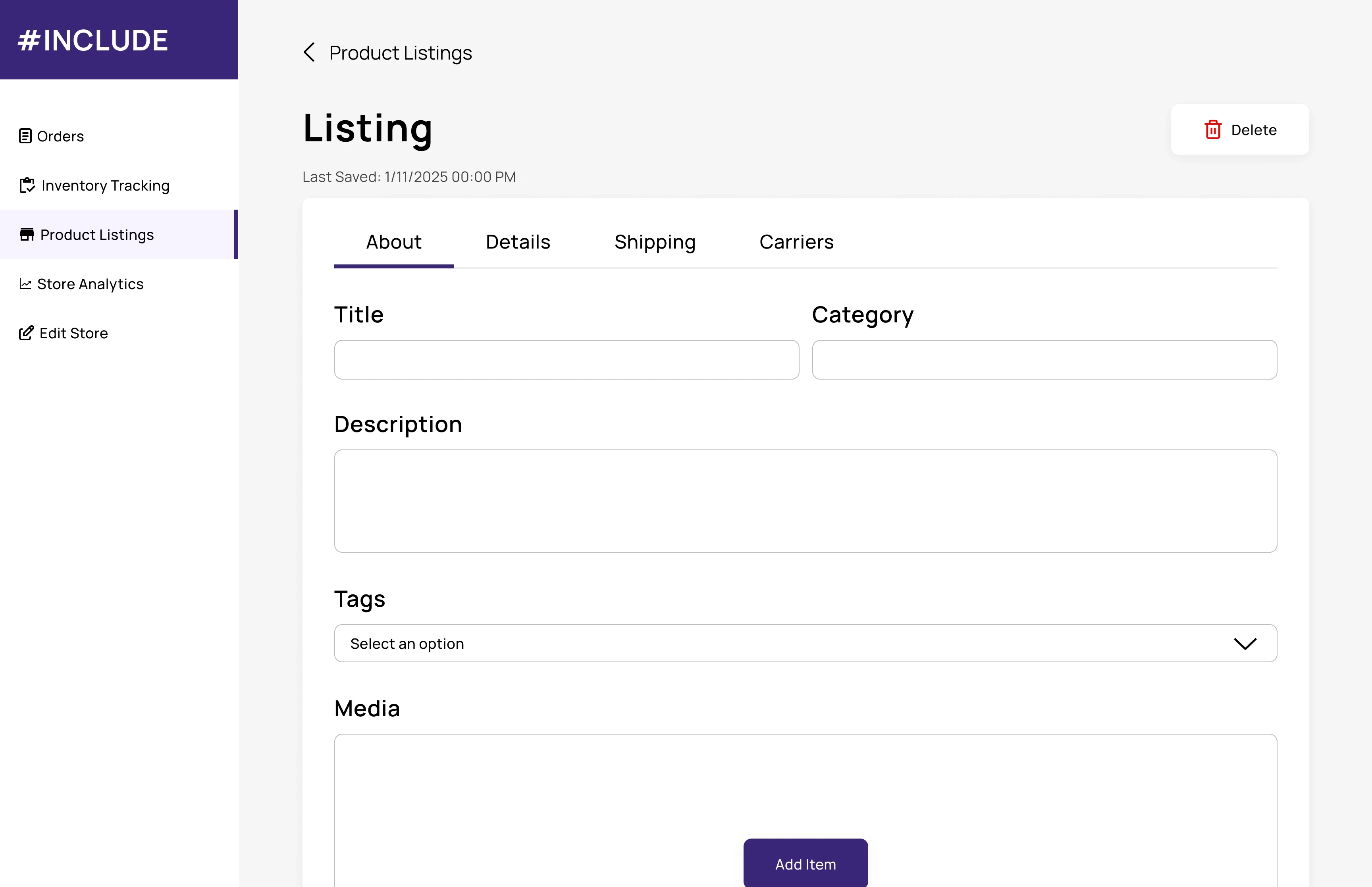
Listing a Product
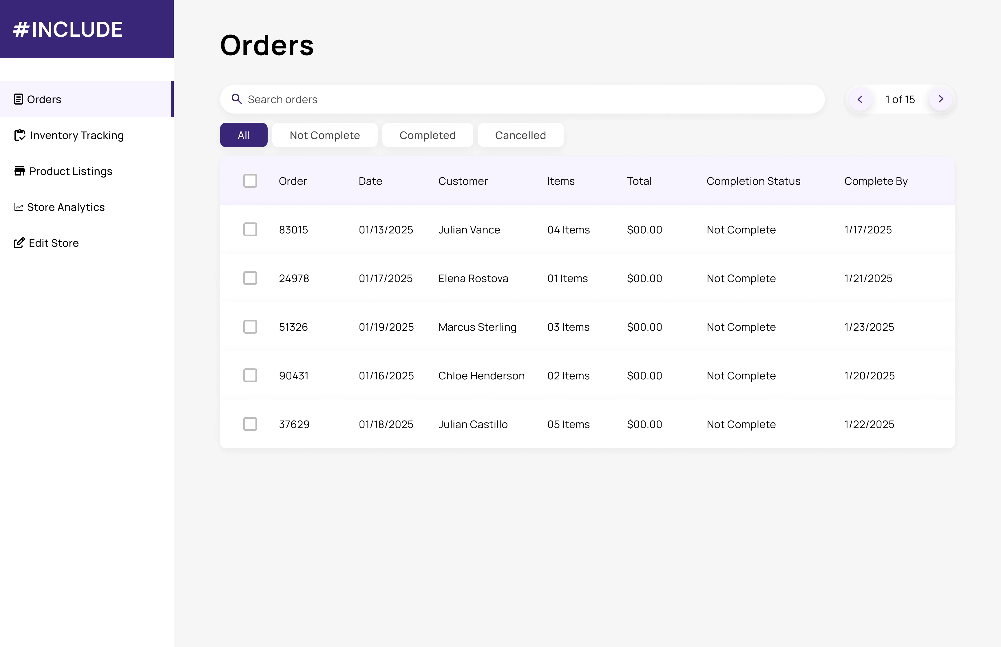
Order Fulfillment
Inventory Tracking

Revision 1A
Adapting to technical constraints
During the first round of revisions, technical constraints shaped several design decisions across two flows.
Carrier options
I designed a carrier comparison feature in the product listing flow so sellers could compare shipping rates without leaving the page. Due to technical constraints, this feature was cut. I instead simplified the shipping section by adding fields where sellers can manually add information.

Orders
To reduce the number of new components needed, I realigned the orders screen to an existing UI pattern. I shifted from a static table layout to a card-based view that surfaces order's product image, fulfillment status, and deadline callout so sellers see what needs action at a glance.
Adding an inventory item
I redesigned the flow to let sellers log their supplier information directly alongside each material. When stock runs low, their supplier information is already there.
Revision 1B
Self-directed improvements
Separately, I revisited the listing flow and inventory tracking to reduce friction for first-time users.
Listing flow
Keeping in mind what sellers told us about tedious listing flows on other platforms, I added contextual examples throughout each field, made package measurement fields optional, and introduced a variants section so sellers could list different versions of a product within a single listing.
Inventory tracking
This was where I refined the materials formula from its early rough state. Sellers can define which materials go into each product, set the quantity needed per unit, and see how many units they can produce from current stock. At the time, it was the right feature, but it was designed in the wrong place.
Revision 2
Moving "Materials" where it belongs
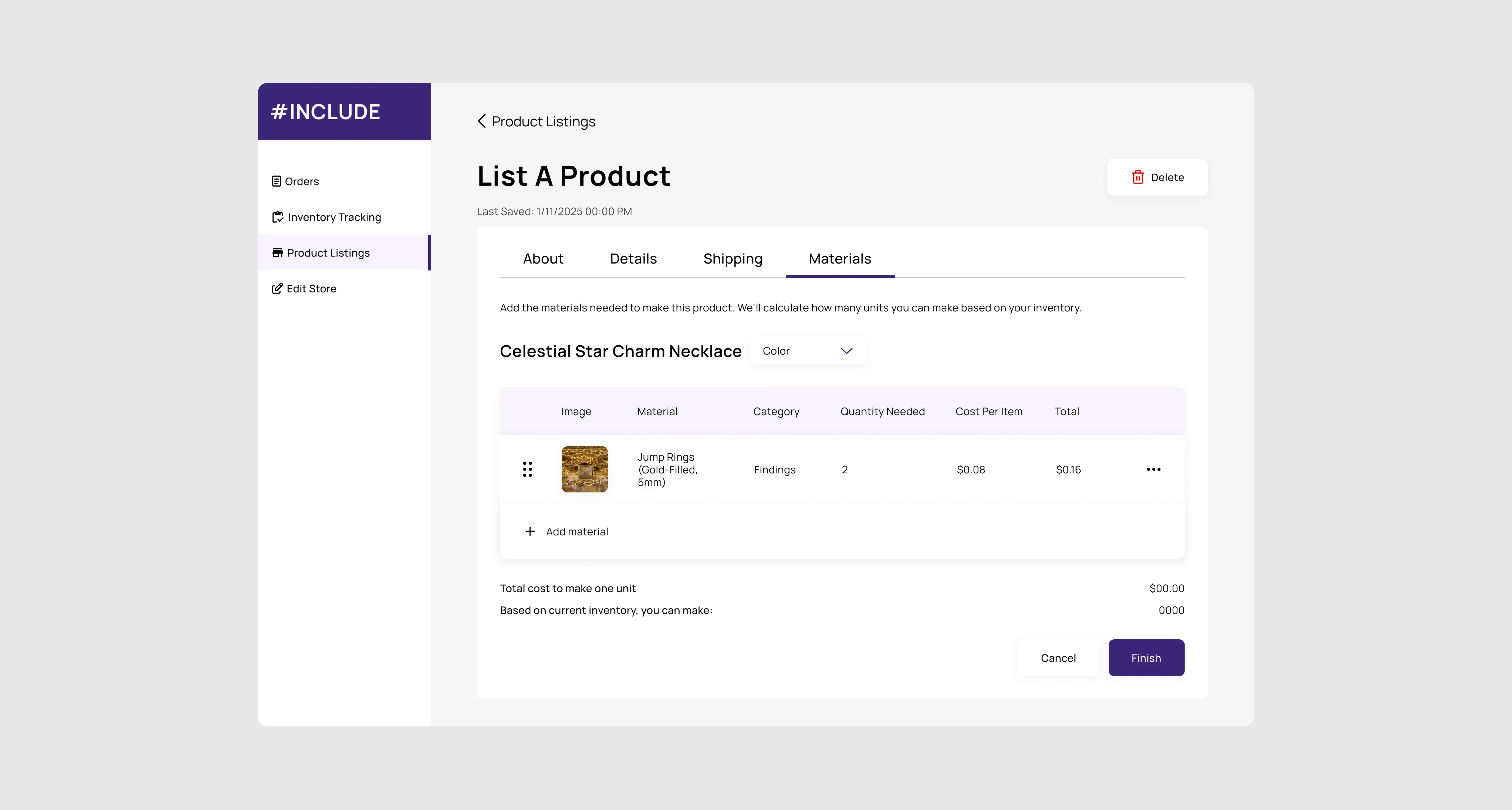
When auditing the full flow after revision 1, I found a structural issue that spoke directly to the cereal box moment. The "Materials" feature lived inside inventory tracking, disconnected from the product listing flow where sellers are already thinking about what goes into a product. Forcing sellers to go to a separate tab to find it wouldn't help them. I moved the feature into the product listing flow as a new "Materials" tab, sitting alongside "About," "Details," and "Shipping."
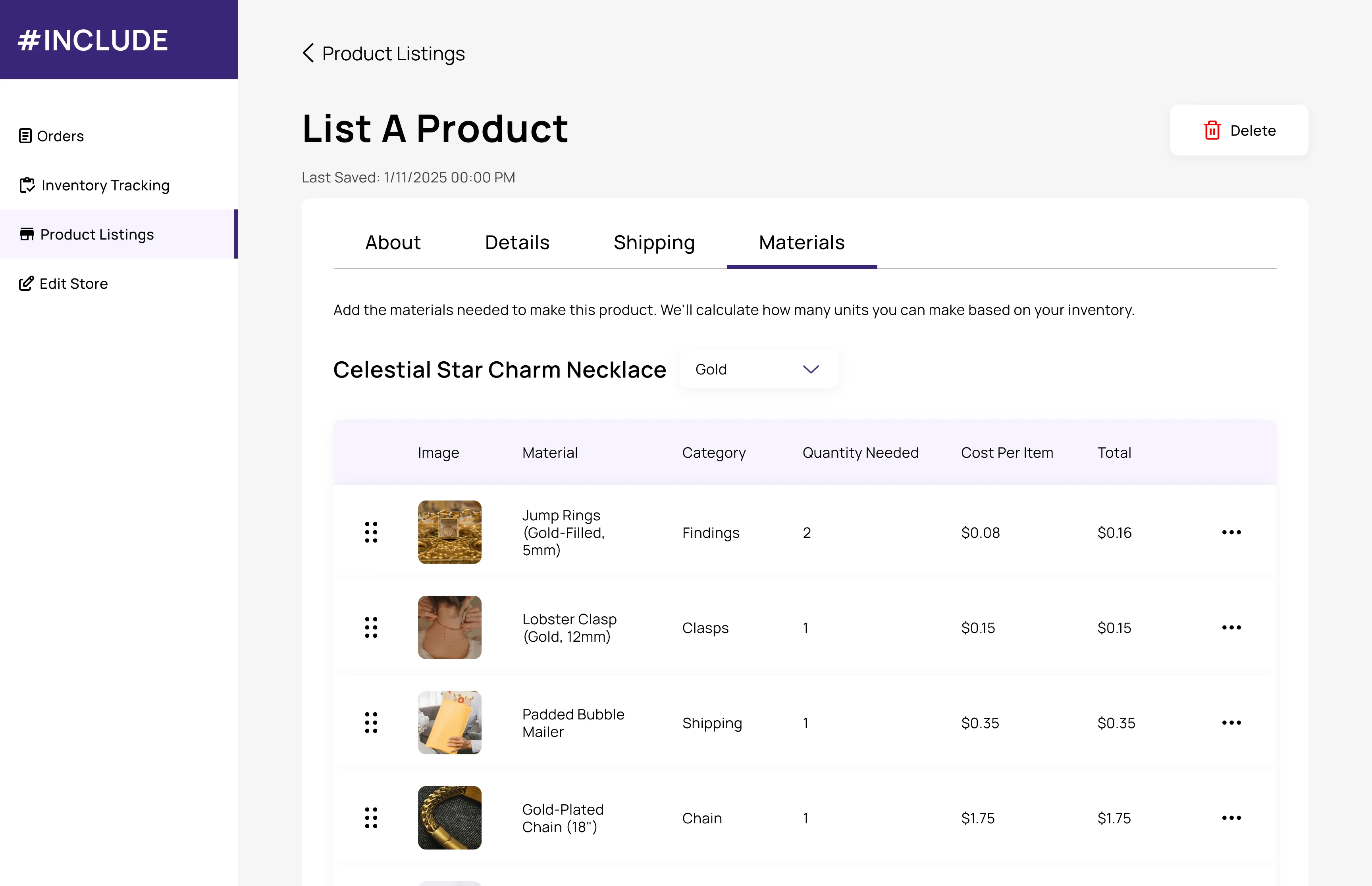
In the new tab, sellers can search and select materials from their inventory, set the quantity needed per unit, see their total cost to make one unit, and see how many units they can produce from current stock. Variant-specific formulas are supported via a dropdown for sellers with multiple colorways or sizes.
Final Design
Listing a product
Keeping in mind that sellers found existing listing flows tedious, I kept required fields minimal and added contextual guidance throughout. The Materials tab lets sellers define what goes into each product and see unit capacity from current stock, so shortages don't surface after a sale has already been made.
Adding an inventory item
Sellers log their supplier information alongside each material so when stock runs low, they know exactly where to reorder from.
Managing orders
A card-based order view prioritizes active orders and highlights upcoming fulfillment deadlines. Sellers can search by order number or customer name and update fulfillment status as they pack and ship.
Reflections
Successes
Connecting research to design decisions: Alongside creating "Materials," the cereal box story also helped me catch a structural flaw after the design already felt done. Keeping that user context present throughout the process led to a meaningful change in the project.
Navigating constraints: Technical limitations pushed me to find simpler and more focused solutions. Losing carrier options pushed me to make the manual shipping fields clearer, resulting in a small change that still served the same underlying need.
Challenges
Balancing time constraints with design quality: As a full-time student working part-time, I had to make deliberate trade-offs about where to invest design time. The materials formula was planned from the start but had to wait until revision 1B. That constraint ultimately led to a better outcome, as having more context about the full flow helped me see more clearly where it belonged.
Key Learnings
Good design requires auditing your own work: The most impactful change in this project came not from the first design pass, but from reviewing the full flow after iteration was already underway.
With more time…
I would prioritize usability testing to evaluate whether sellers can complete the product listing flow without dropping off, navigate inventory setup without confusion, and find and use the Materials tab without guidance.