I redesigned Digital NEST's End-of-Year landing page to strengthen impact storytelling and integrate new branding. Co-led layout and visual system design with the design lead. Owned data visualization, motion design, and responsive UX. Redesign outcome was a 120% increase in average gift size.
Research
Analyzing the previous webpage design
I conducted user interviews to understand how the previous page was interpreted and a competitive analysis to see how other non-profits were showcasing their data.
The Problem
Through user interviews and competitive analysis,
several opportunities emerged:
Storytelling
Impact
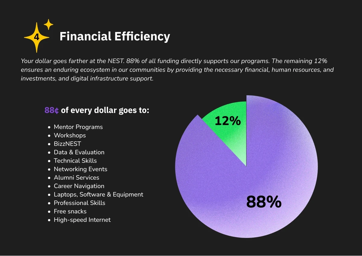
Conveying to donors exactly how their funds are utilized
New look
Applying their new rebrand consistently
Design Process
Creating impactful data visualization
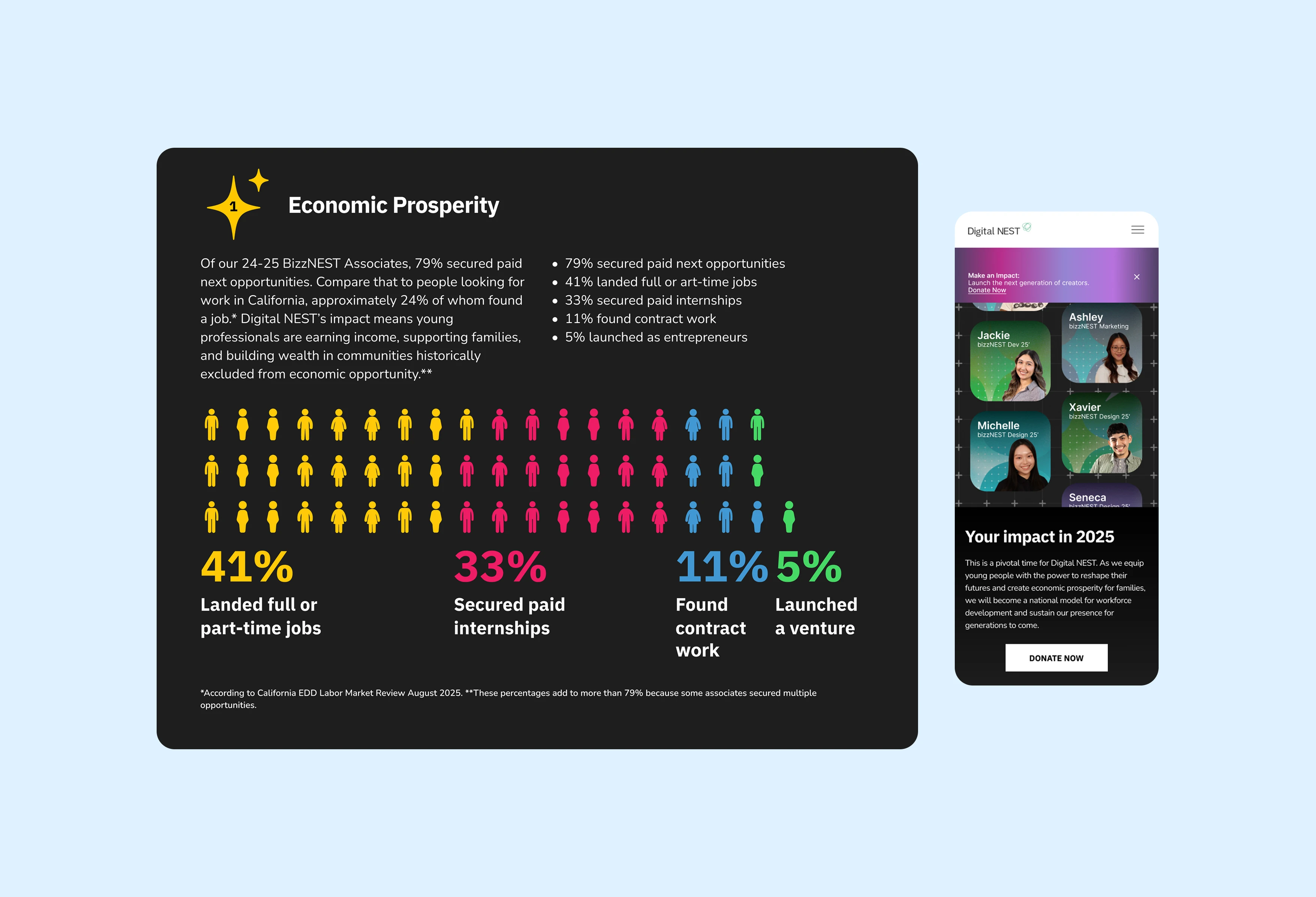
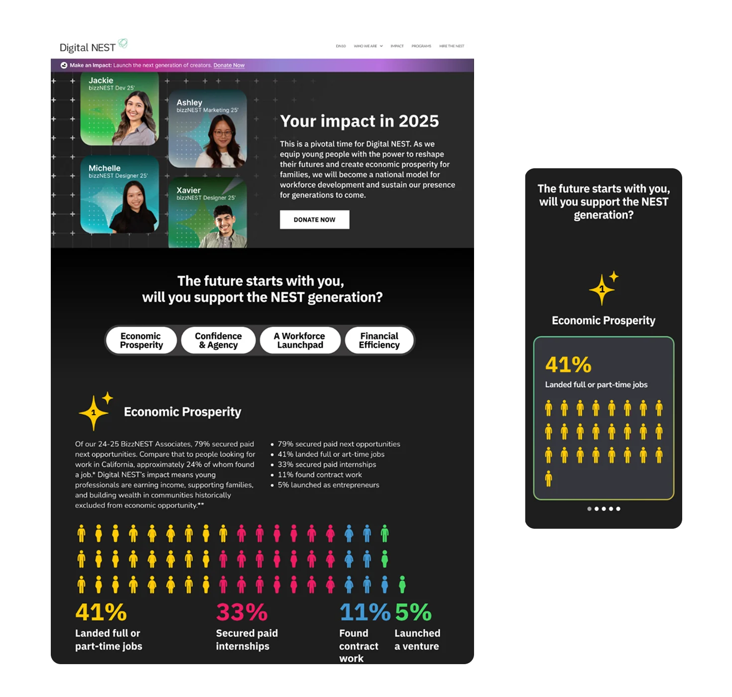
The dataset for Economic Prosperity showed the types of opportunities alumni secured, with multiple categories contributing to a single outcome. A pie chart was initially proposed, but I introduced a pictogram/waffle chart to emphasize scale and human impact while minimizing visual focus on unreported data.
Emphasizes 21% of associates
that did not report data
Shows categories and highlights unique members
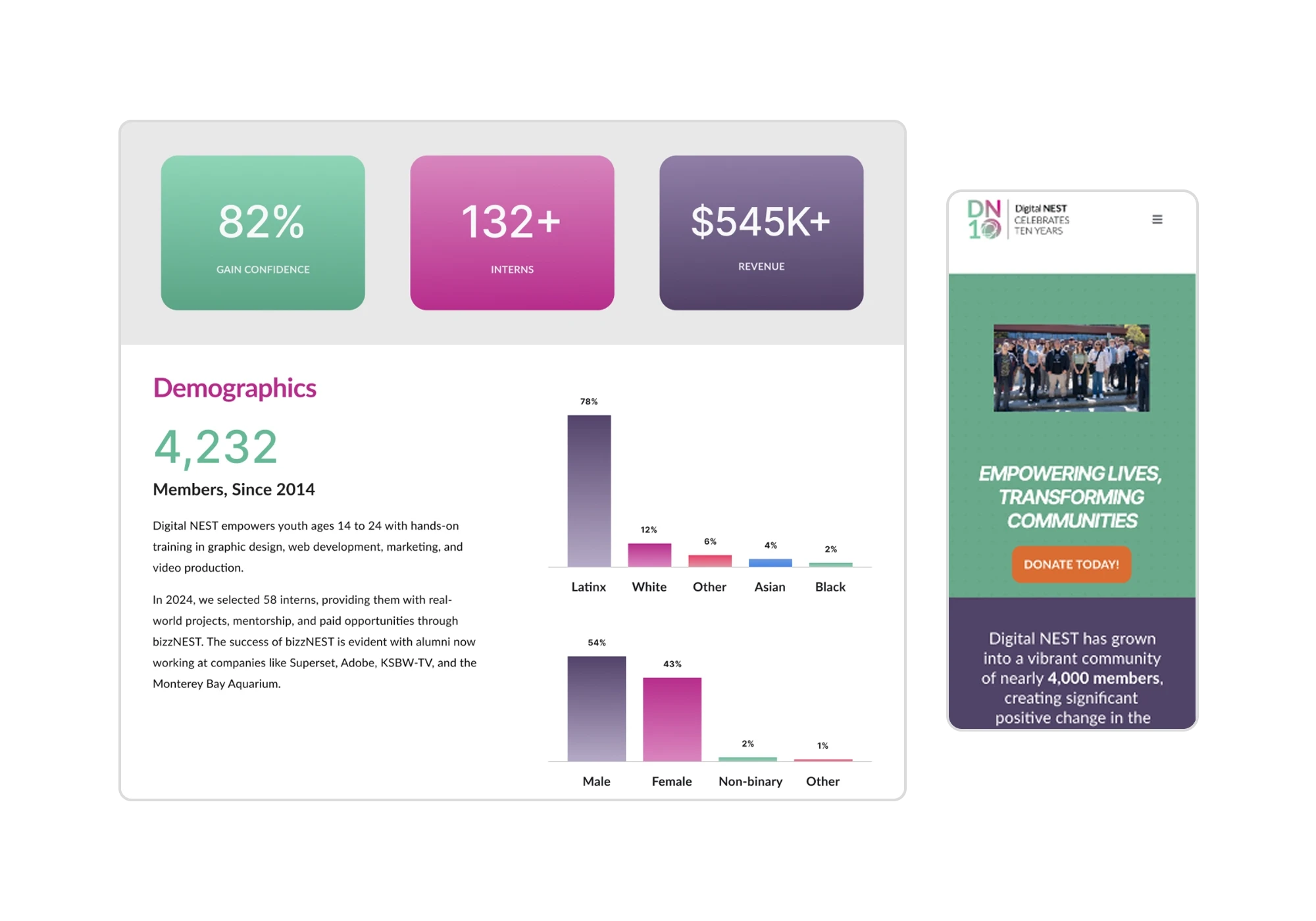
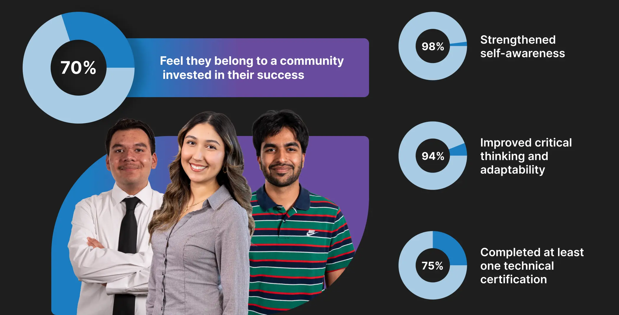
For Confidence & Agency, the dataset showed how associates gained skills through percentages, but did not show before-and-after comparisons. Initially, vertical bars were explored but they highlighted associates that did not gain skills. Instead, I designed a card-based system pairing percentages with images.

Highlights 38% of associates that did not feel confident
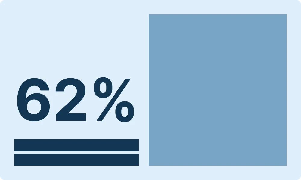
Emphasizes 62% of associates that gained confidence
Reducing cognitive overload on mobile
Once the desktop design was finalized, we transitioned into mobile and identified a usability issue. The desktop layout resulted in excessive vertical scrolling when translated to mobile, making the content feel overwhelming despite working well on larger screens.
To solve the newly discovered problem, we explored multiple mobile layout options and chose to use horizontal card carousels for each data category.
This allowed us to preserve all text and animations and reduce vertical scroll by ~48%.
Previous Mobile Design

Revised Mobile Design

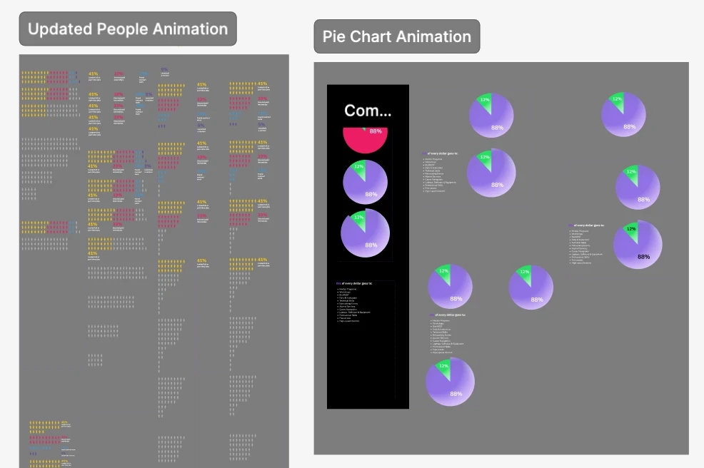
Adding movement to the data
I created motion design for the statistics. Every animation had a purpose, whether that was reinforcing reading order or making the timing feel natural.
On mobile, I added the animations within the carousels since they were triggered by hovering on desktop.
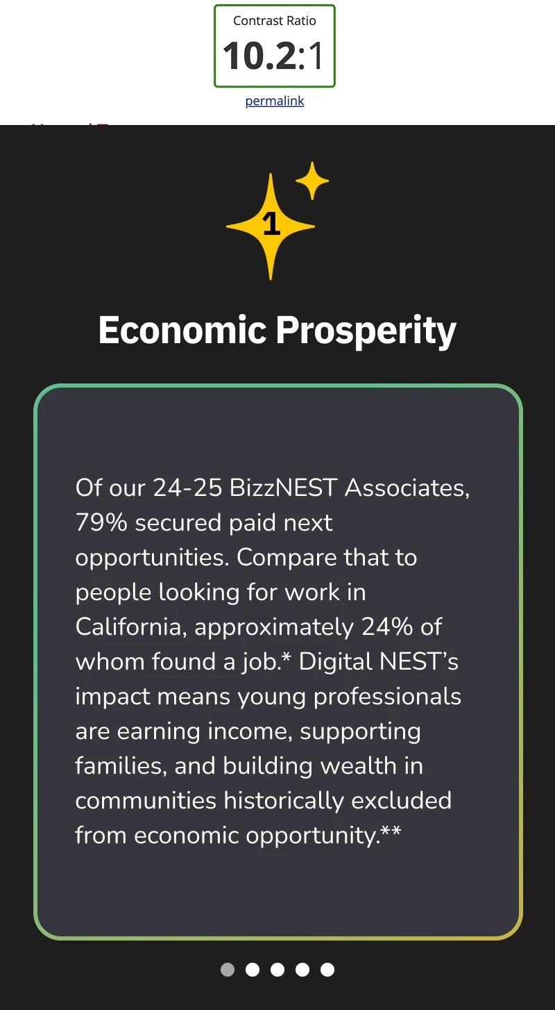
Improving color contrast ratio by up to 180%
I made revisions to the final design by checking color contrast. I made changes to text color and backgrounds, ensuring that they were WCAG compliant.
Solutions
Numbers with a story
Statistics were paired with context and highlighted associates. With motion design incorporated, these created visuals showing our impact to donors.
Using motion design for storytelling
Everything was documented through Smart Animate prototypes, so developers had a clear reference to build from.

Giving the website a refresh
I incorporated the new branding guidelines consistently throughout the webpage design by establishing a design system with text and color styles.
Final Design
Seeing it all come together
Outcome
The Digital NEST End-of-Year landing page has reached…
in average gift size
since website launch
in first month after launch
Reflections
Successes
Cross-functional clarity: Building Smart Animate prototypes in Figma sharpened my ability to communicate motion and interactions to developers, reducing ambiguity.
Increase in average gifts size: The data visualizations and motion design were crafted to communicate the organization's impact at a glance. Seeing average gift size increase validated not just the design choices, but how effectively the work conveyed their mission to donors.
Challenges
Balancing business goals with user needs: Stakeholders needed extensive copy for legal reasons and consistency with their newsletter campaign. But that volume of information created cognitive overload for donors. I had to weigh both concerns and ultimately prioritized consistency, keeping the copy while finding ways to present it without overwhelming the experience.
Key Learnings
Mobile needs its own system: Discovering the vertical scroll issue during mobile adaptation showed how desktop decisions can’t be mirrored directly. Designing the horizontal carousel system strengthened my responsive UX approach.
With more time…
I would prioritize usability testing on both desktop and mobile to evaluate how donors interpret the data, engage with the animations, and navigate toward the donation CTA.